Buck Slip
Q4 Active
Professional, Cohesive, Engaging
Los Angeles, CA

Buck Slip
Q4 Active
Professional, Cohesive, Engaging
Los Angeles, CA
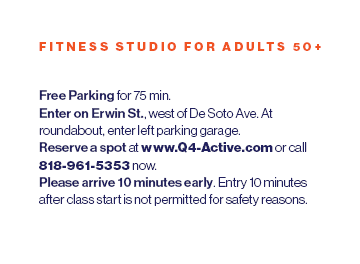
Polished Buck Slip Flyer Design for Q4 Active
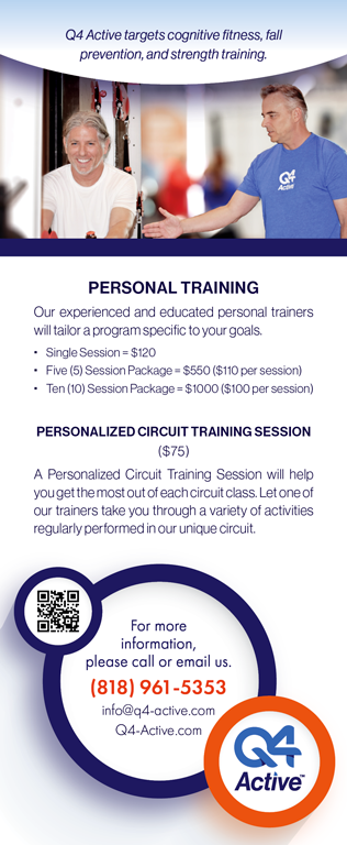
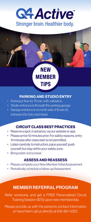
The Q4 Active buck slip flyer design, crafted with insight from Graphic Designer Linda Sturling, is polished and professional, with a cohesive color scheme of blue, white, and orange that matches their brand colors. The logo and tagline are prominently displayed, establishing the brand and its mission. The layout is clean and organized, with clearly divided sections, bold headings, and ample white space, ensuring easy readability and guiding the viewer through key information. High-quality lifestyle photography adds warmth and relatability, reflecting the brand’s inclusive and welcoming ethos.
Content, thoughtfully structured under the guidance of graphic designer Linda Sturling, caters to new and potential members. The call-to-action elements, including a prominently placed QR code and contact details, encourage immediate engagement. Overall, the design successfully blends visual appeal with functional clarity, effectively communicating Q4 Active’s offerings and fostering a strong connection with its target audience.
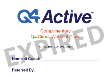
RELATED GRAPHIC DESIGN / photography & card design
Thoughtful Design Analysis by Graphic Designer Linda Sturling
- Logo and Tagline: The Q4 Active logo is prominently placed, creating instant brand recognition. The tagline, “Stronger brain. Healthier body.” reinforces the mission of the organization and connects to its fitness focus, a detail Graphic Designer Linda Sturling emphasizes as crucial for strong branding.
- Consistent Color Palette: The flyer employs a professional and cohesive brand color scheme.
- Divided Sections: The flyer is organized into clearly defined sections with distinct headings. Graphic Designer Linda Sturling’s attention to layout ensures readability and guides the viewer through the content seamlessly.
- White Space: Adequate white space ensures the design does not feel cluttered, making it visually appealing and easy to scan, a key principle Linda Sturling applies in her designs.
- Hierarchy: Bold fonts are used for headings, with regular fonts for body text. This hierarchy ensures key information stands out, a detail Graphic Designer Linda Sturling identifies as vital for clarity.
- Legibility: The font choice and sizes prioritize legibility, catering to Q4 Active’s target audience.
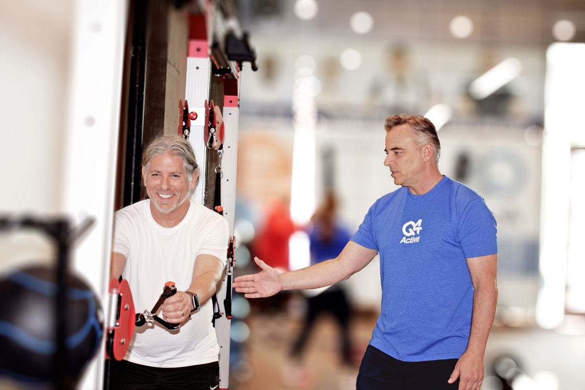
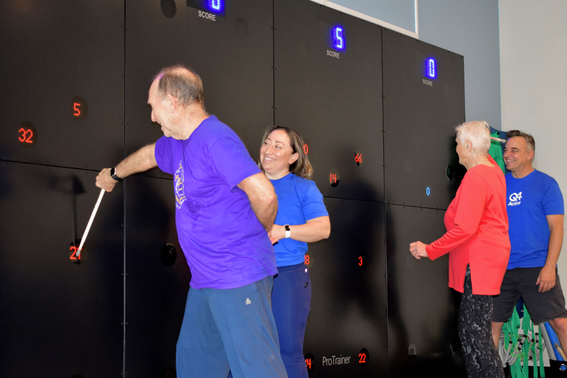
- Photography: High-quality images showcase happy and active participants, aligning with the brand’s message of fitness and wellness. Graphic Designer Linda Sturling’s approach ensures the photos add warmth and relatability.
- Shot on Location: Graphic Designer Linda Sturling proposed her photography services to the client, emphasizing the importance of capturing dynamic images that showcase the services in action while highlighting their ideal target audience. Through professional photo editing, Linda delivered a versatile collection of images, providing the client with hundreds of high-quality photos from a single session, ready to be used for future projects and social media campaigns.
- Graphic Designer Linda Sturling created the buck slip flyer design with a user-centered focus.
- The flyer design builds trust and facilitates decision-making, a design element Linda champions.
- Prominent placement of contact info, including a QR code. Linda Sturling’s focus on actionable design ensures these elements are easy to find.
The flyer design balances professionalism with approachability. It effectively communicates essential information while inspiring potential clients to engage with Q4 Active’s services. This polished and purposeful approach reflects Graphic Designer Linda Sturling‘s expertise in creating user-centered, impactful designs.


